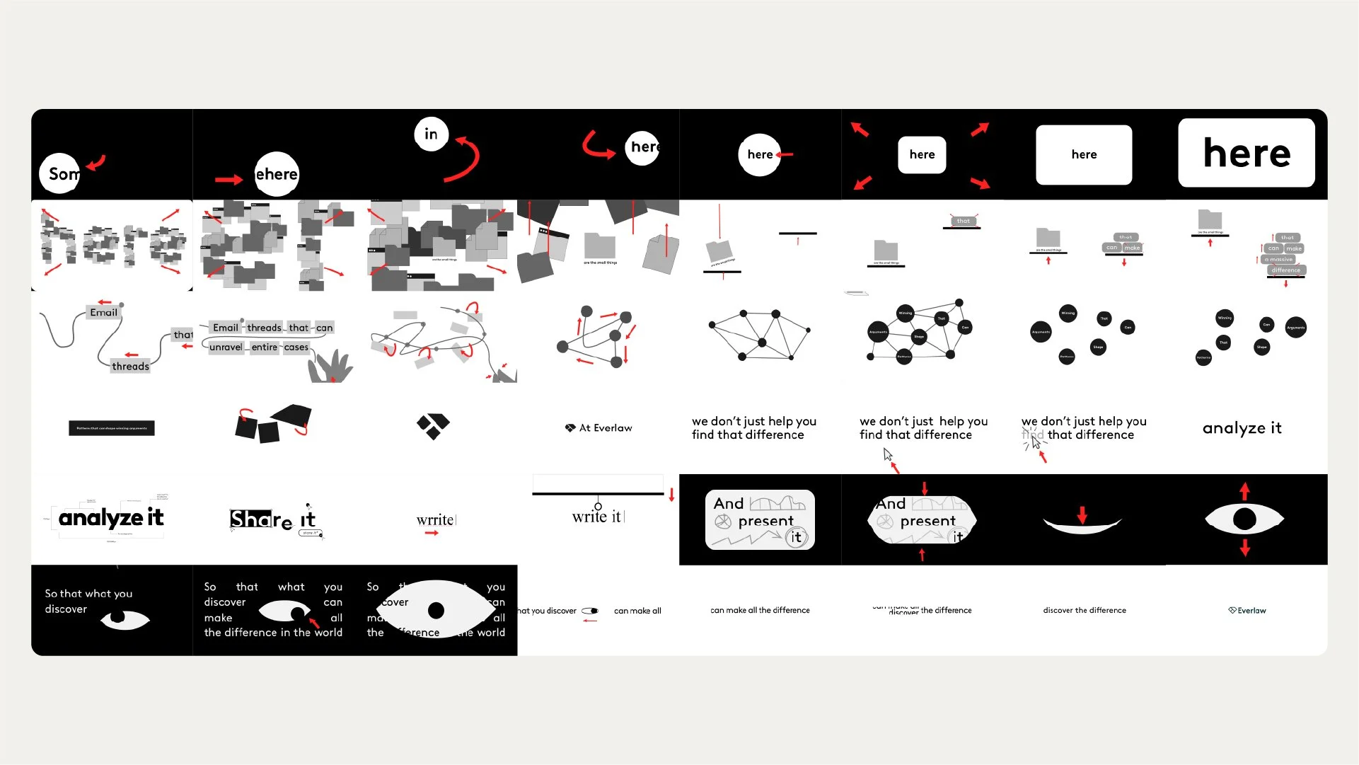
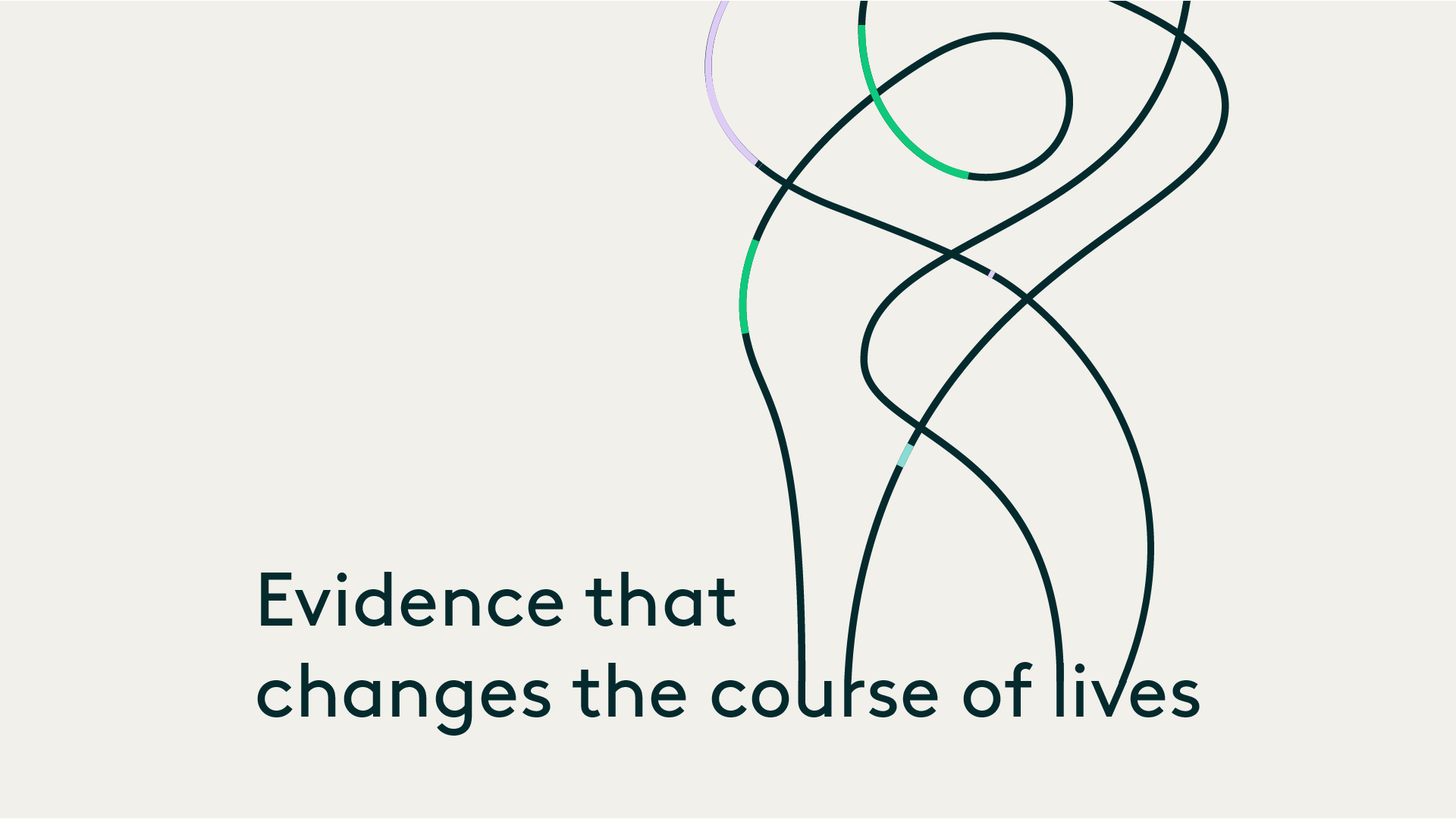
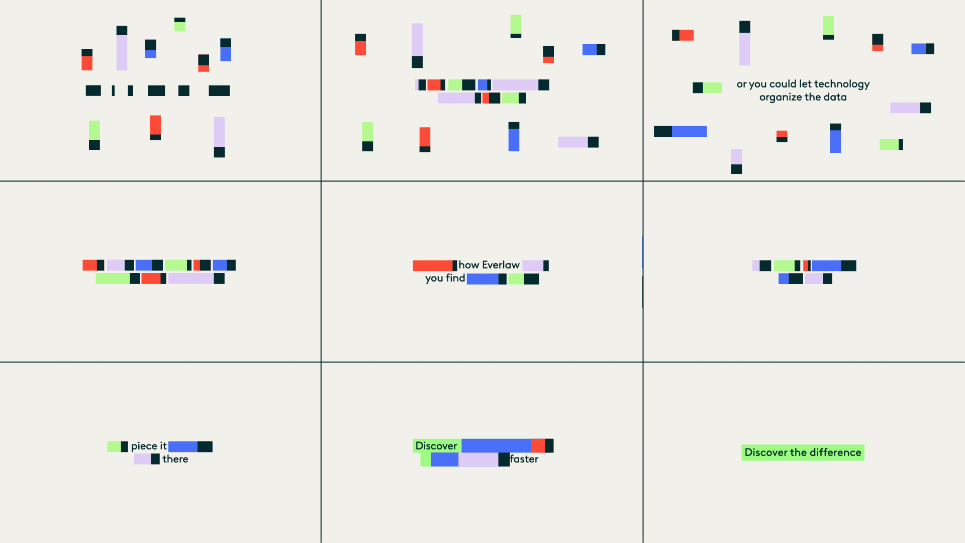
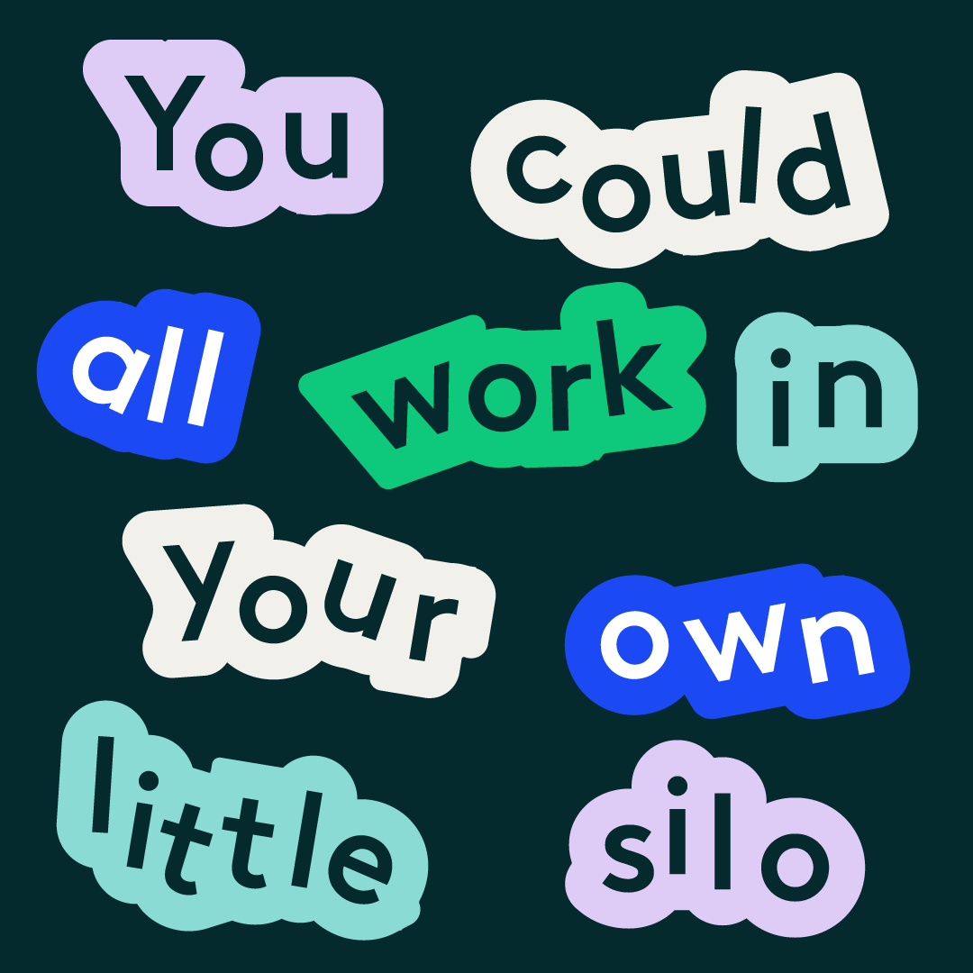
Brand → Motion
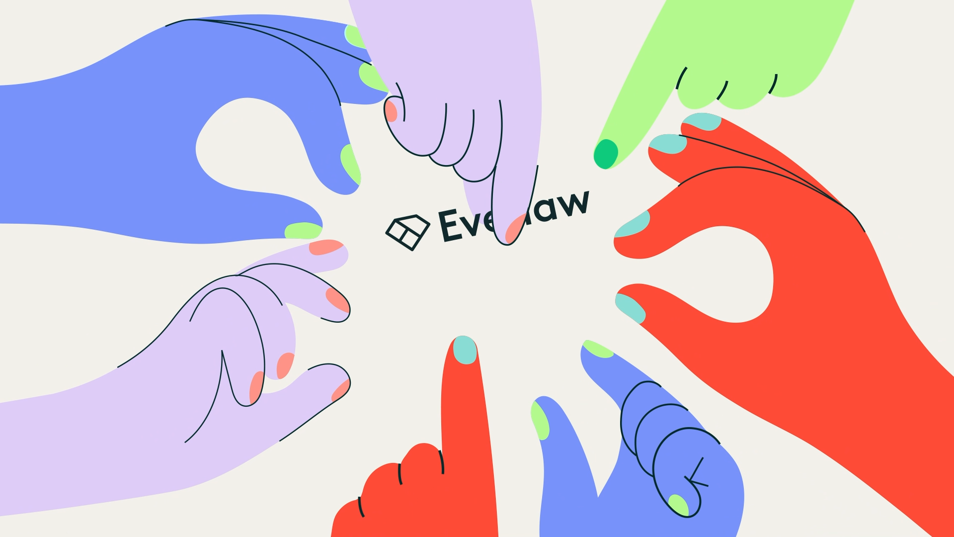
Everlaw’s visual identity gave us a strong foundation: a light parchment beige base, paired with vibrant accent colors and the Brown typeface. Our task was to translate this system into motion in a way that felt confident, approachable, and consistent.
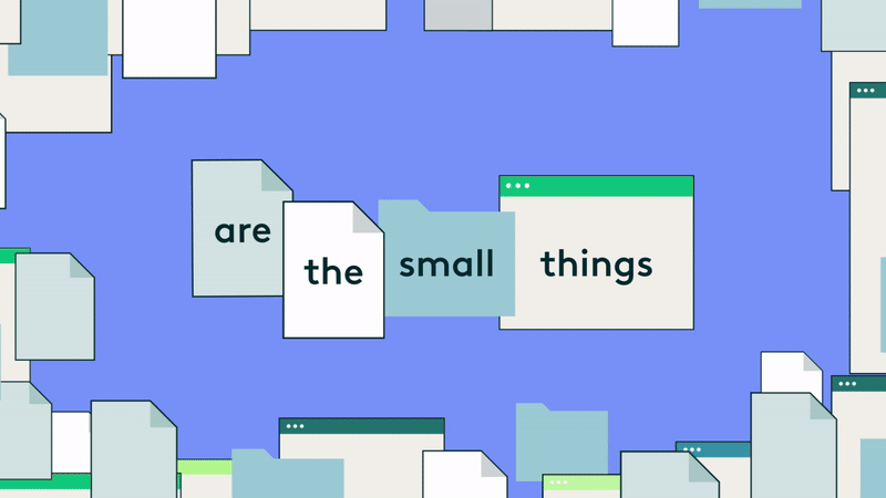
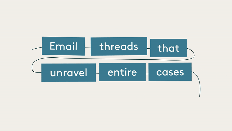
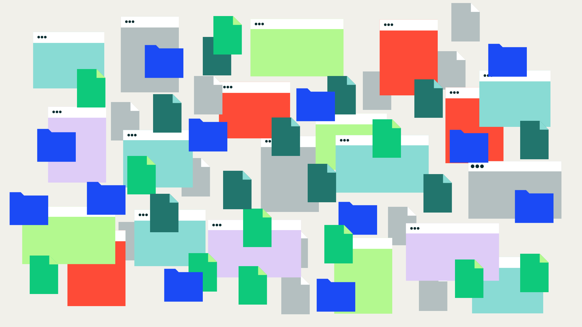
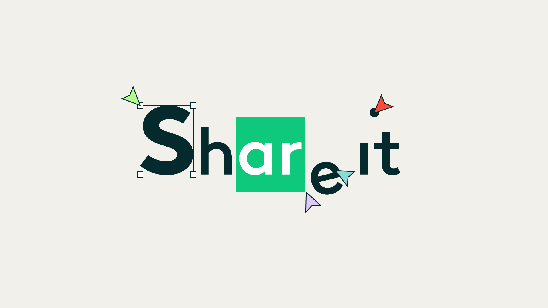
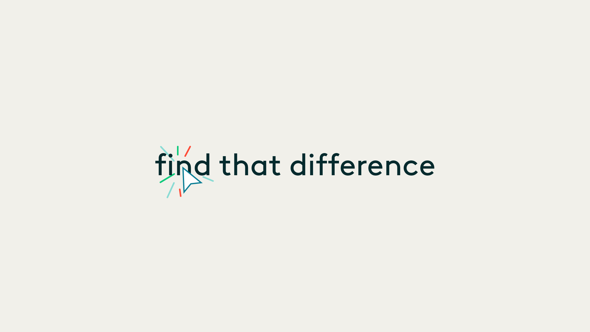
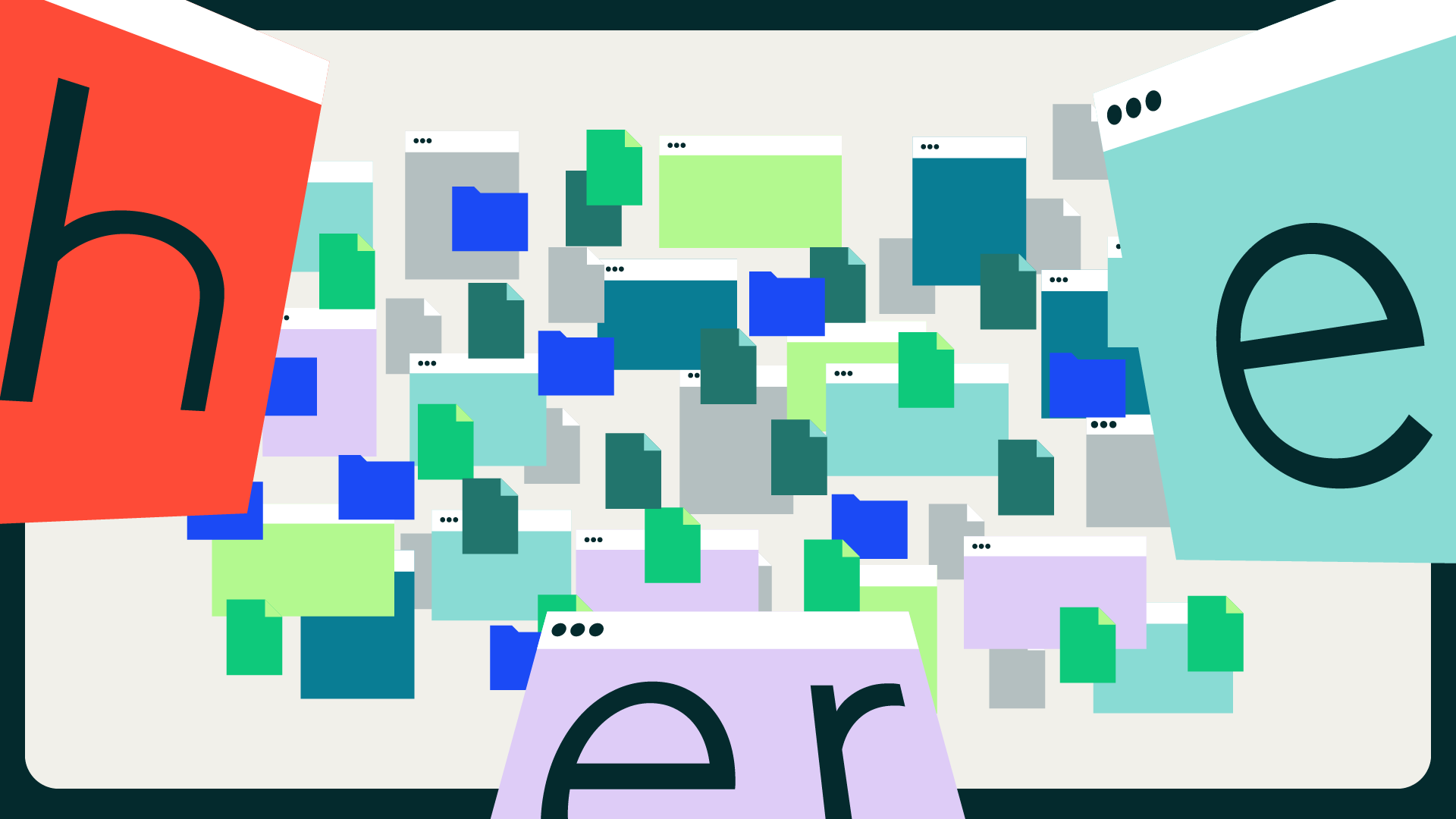
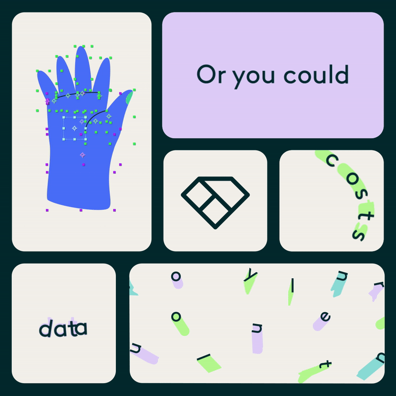
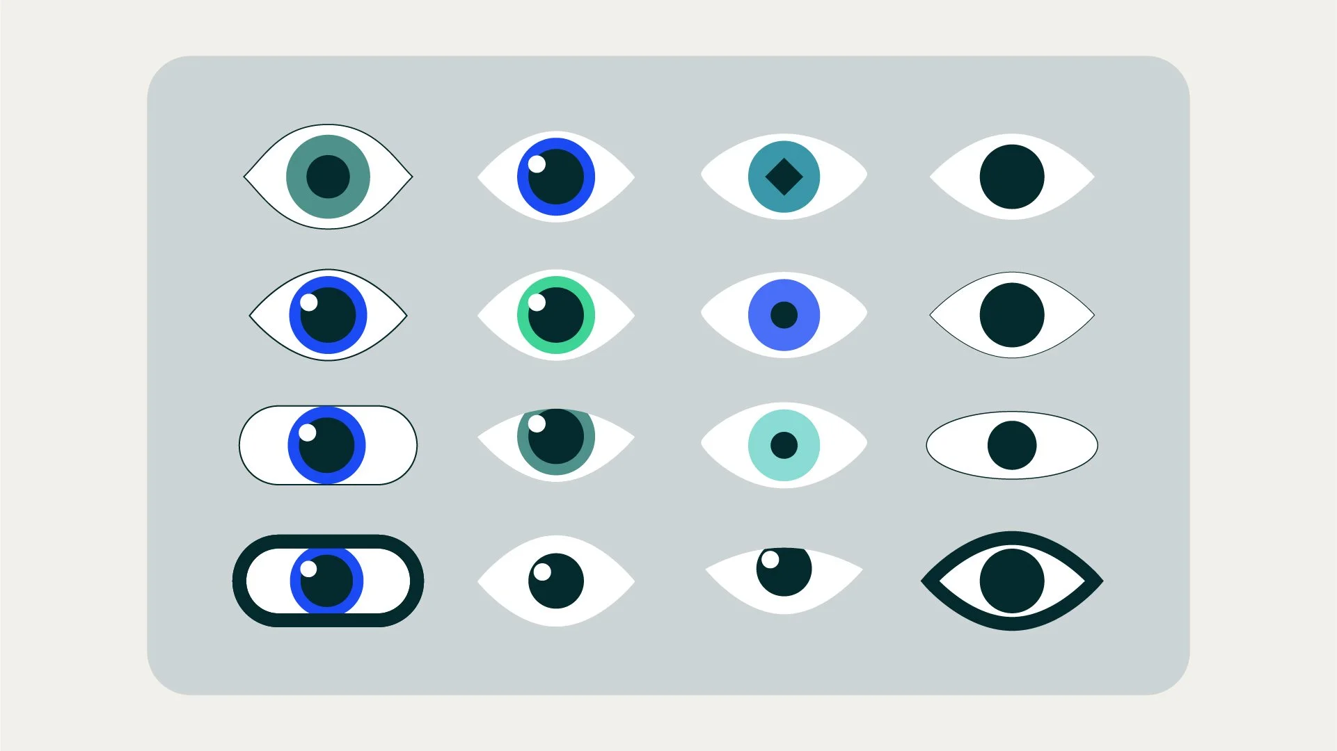
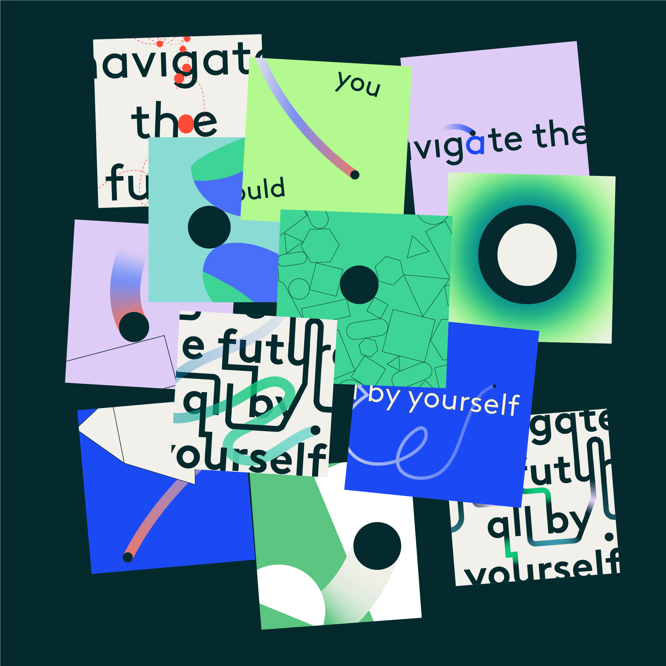
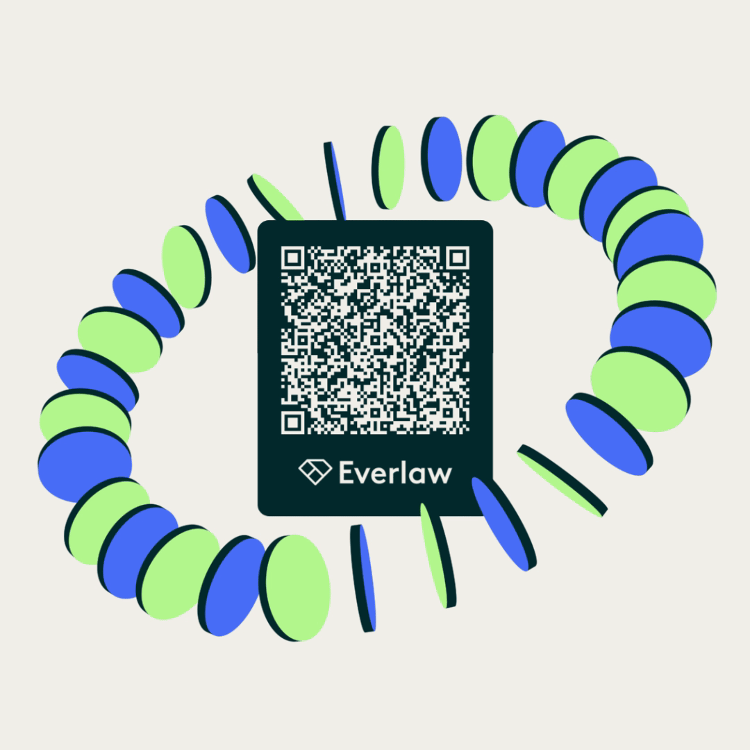
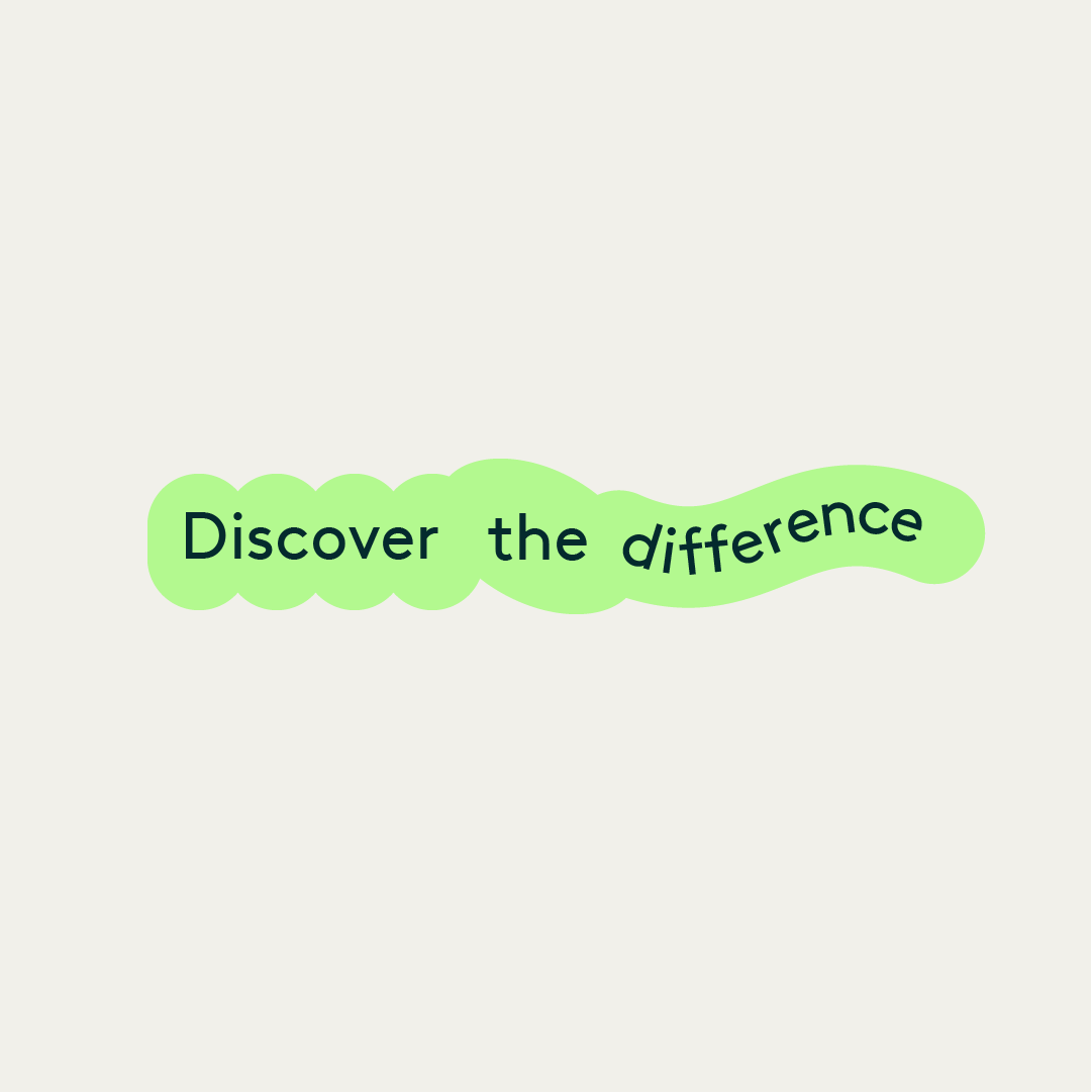
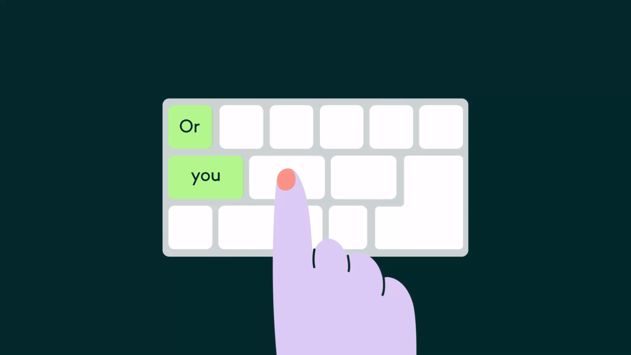
Since illustration wasn’t a core part of the brand, we created a new set of minimal, iconic visuals inspired by UI and everyday digital objects - search bars, keyboards, cursors, magnifying glasses, and interface elements. These simple shapes became the building blocks of the campaign’s motion language.