MAAYAN ERLICH- MOTION&DESIGN
Island Typo_07_V06 (0-00-00-00).png

The Enterprise Browser

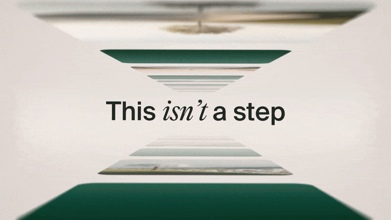
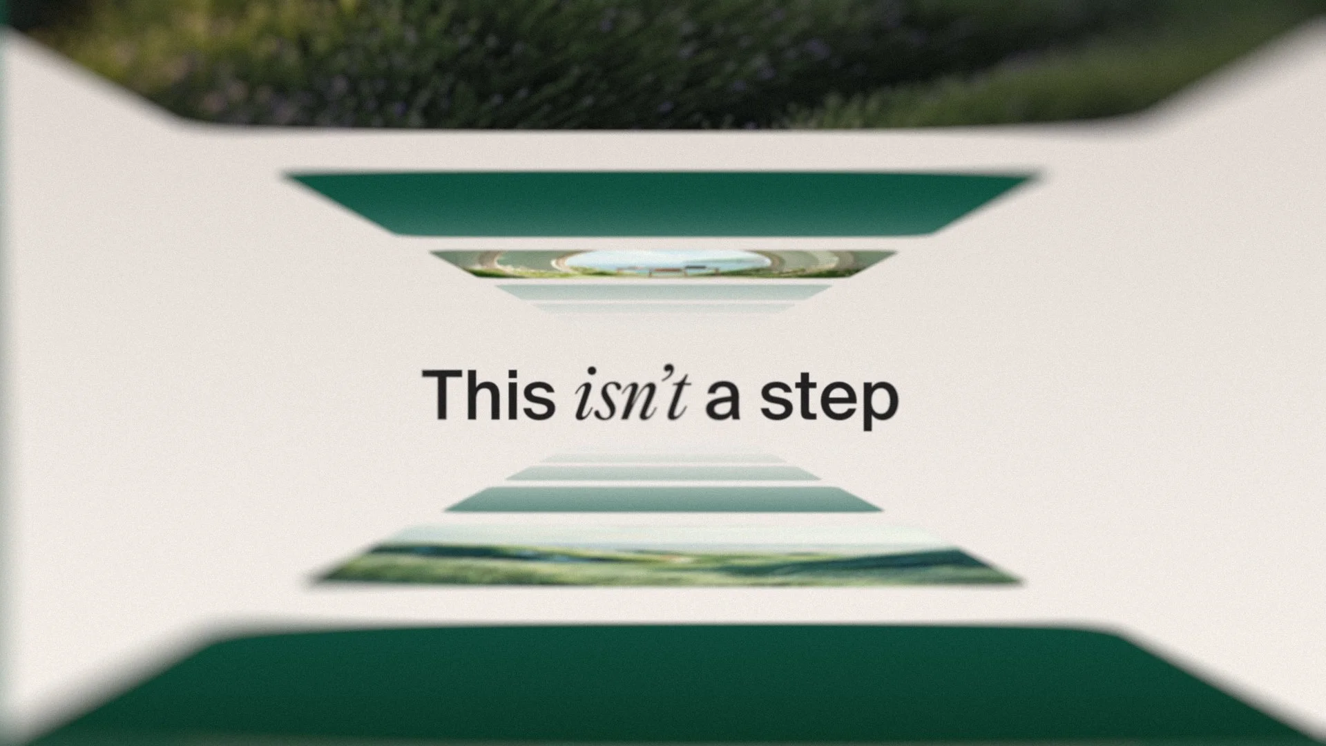
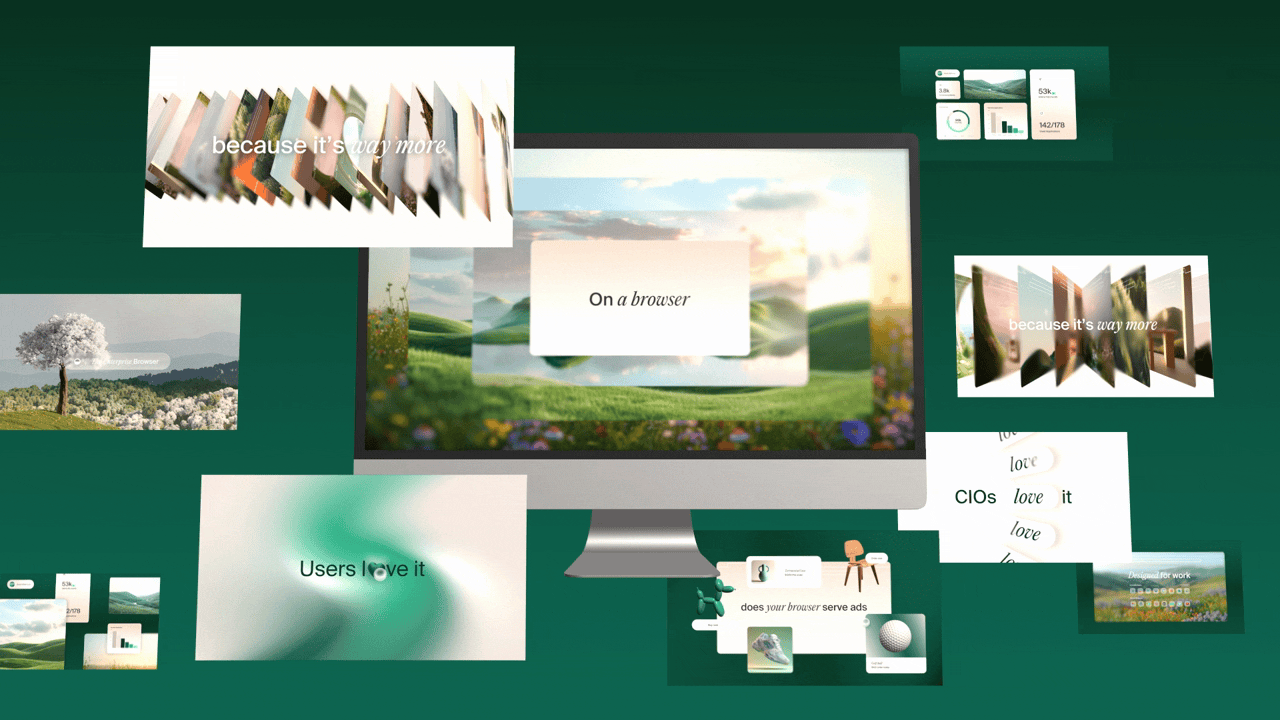
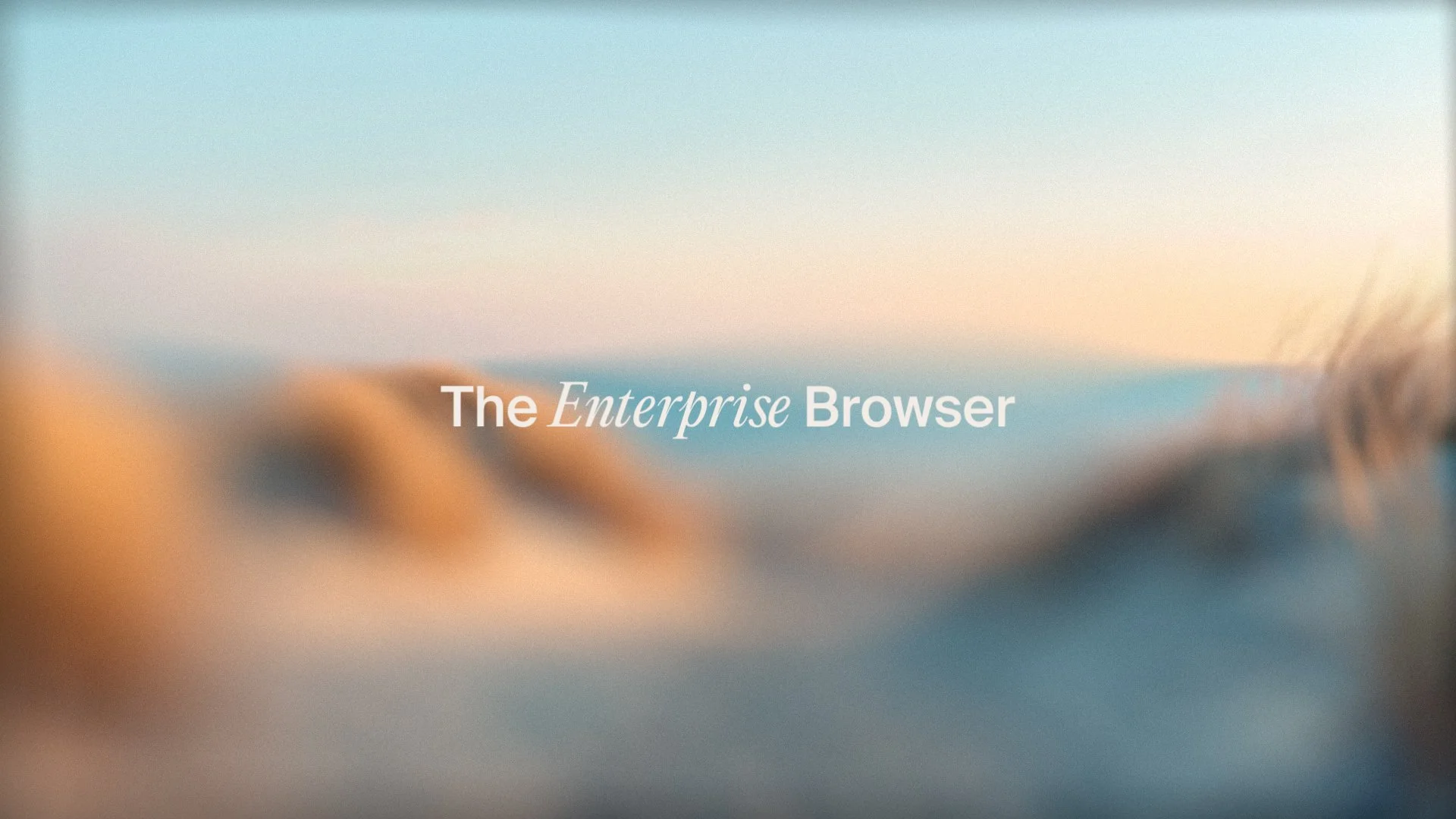
Series of four animated spots for @island.io, the Enterprise Browser. The creative challenge for the series was to take one of the brand's key taglines and bring it to life through a distinct, motion-driven narrative.

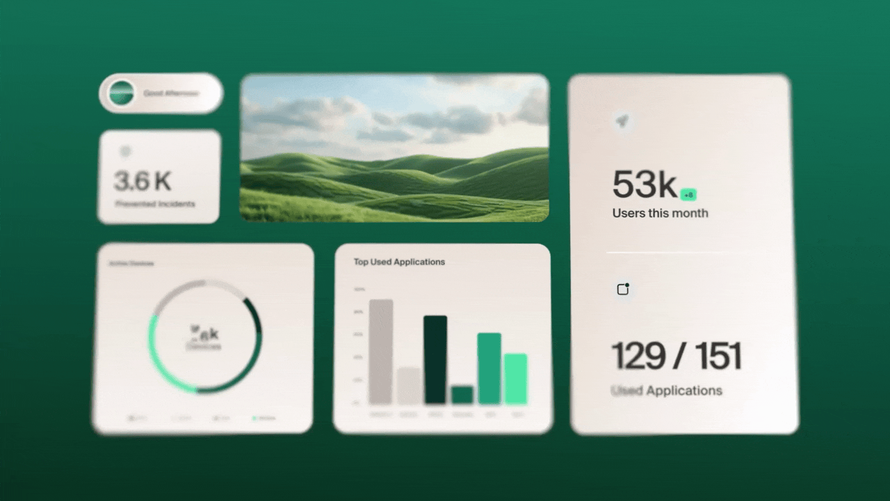
The motion style is intentionally vibrant and sleek, designed to feel both modern and organic. We used smooth motion blurs to support this natural, flowing vibe, seamlessly integrating AI-generated videos of zen-like natural locations as background textures. Crucially, we also incorporated elements of UI design into the visual concept to keep the focus firmly on the product. This is all tied together with vibrant, kinetic typography that reinforces the tagline's message. The goal was to create a style that feels energetic, refreshing, and distinct for the series.

Video 1 — “Users Love Island”


This video is all about minimalism.
We challenged ourselves to build sharp, balanced compositions using as few elements as possible — while staying true to Island’s visual language. The piece combines 2D and 3D elements with subtle cursor interactions to give the browser a tactile, responsive feel. The result is clean, precise motion that puts clarity first.

Video 2 — “A Step in the Right Direction”

Here the concept focused on the smooth journey you take using Island’s browser — instead of the clunky, frustrating “small steps and mishaps” you get elsewhere.
We leaned heavily into timing and animation polish: refined keyframes, elegant spacing, and transitions that feel effortless and confident.
Every movement is designed to feel like forward motion.

Video 3 — “Designed for Work”


We combined trippy, abstract environment footage with custom-animated UI widgets, designed to feel responsive, smart, and purpose-built for work. The interface elements snap, scale, and adapt in a fluid 3D space — showing how Island brings structure and clarity into chaotic digital environments.

Video 4 — “Does Your Browser Serve Ads?”


For this one, we leaned into visual chaos: messy pop-ups, loud compositions, and exaggerated ad-style layouts built from 3D elements and bold gradients. A fast spinning move cuts through the noise and reveals Island’s clean UI widgets, clearing the screen and shifting the tone completely. And ending with a quiet, calm white-sand beach — a simple metaphor for distraction-free browsing.

Natural landscapes

Rather than generic backdrops, we implemented distinct, photorealistic landscapes for each video, intentionally balanced to sustain and deepen the user's perception of Island tranquility.

Style frames and Design explorations

Our creative process began with in-depth design explorations to fully articulate the visual voice of the island.io series. We aimed to create a look that was both technologically sleek and humanly organic.

Credits

Motion design, Design, Concept and Storyboard- Or Drori & Maayan Erlich

Sound design - Ilai Schwebel

Thanks to Island’s in-house creative team:
Tami Ozsinay | Shani Vigo | Tom Chen